
Kitchen Canvas Art
Kitchen wall art finishes a space that often gets overlooked. Between cabinets and counters, there's usually wall space that sits empty. The right art transforms kitchens from purely functional to actually designed... read more
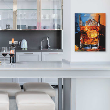
Kitchen art needs to work with the realities of the space. Grease, steam, and splashes are factors. Canvas prints hold up better than paper. Placement matters too. Keep art away from direct heat and heavy splash zones.
What works in kitchens
Food and beverage themes are obvious choices for kitchen decor. Coffee, wine, produce, herbs. But kitchens also handle abstracts, nature scenes, and anything that fits your home's overall style. Don't feel limited to food imagery.
Kitchen canvas art works well above sinks, on walls between cabinets, and in breakfast nooks. Consider the colors already in your kitchen. Countertops, backsplash, and cabinet colors should guide your art choices.
For related themes, explore coffee art or wine art.
See our kitchen botanical wall art.


