
Orange Art
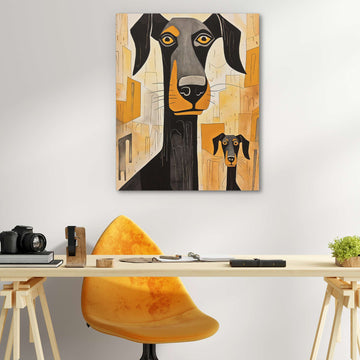
Orange wall art brings warmth and energy that few colors can match. It's bold, it's optimistic, and it adds life to neutral spaces. From burnt sienna to bright tangerine, orange makes rooms feel more alive... read more
Orange art works because it combines the energy of red with the cheerfulness of yellow. It's stimulating without being aggressive. Rooms with orange accents feel warmer and more welcoming than those without.
Pairing orange
Orange paintings pair beautifully with gray, navy, teal, and brown. These combinations feel sophisticated rather than overwhelming. Orange and grey wall art is particularly popular for modern spaces where you want warmth without chaos.
Burnt orange and rust tones fit naturally with earth tone palettes. Brighter oranges make bolder statements and work well as accent pieces in otherwise neutral rooms.
For similar warmth, explore earth tones or sunset paintings.


