
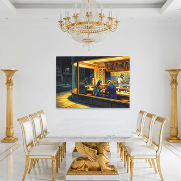
Gold Living Room Wall Art
Gold living room wall art is the easiest way to make the room feel finished. A little gold reads as luxury and lifts a neutral space without taking over... read more
The gold you choose sets the tone. A deep, brassy gold feels traditional, champagne gold is softer and lighter, and black and gold is the high-contrast, luxe option. Gold also sits naturally with cream, charcoal, deep green, and navy.
Scroll down for the full styling guide, including how to size a piece above the sofa and which golds suit which rooms.


Designing a gold living room
Gold is the easiest way to make a living room feel finished. A little of it reads as luxury, and it lifts a neutral room without taking over. The trick is picking the right gold and giving it room to stand out.
Gold#c9a24bRich and classic
Champagne#e6d3a3Soft and light
Brass#b08d57Deep and earthy
Black & Gold#141414High-contrast luxe
Start with the right gold
Not all golds read the same. A deep, brassy gold feels traditional and pairs with wood and leather. A paler champagne gold is softer and works in a calmer, neutral room. And black and gold is the high-contrast option, the one that reads as luxury from across the room. Compare the range in the full gold wall art collection, or go straight to black and gold if you want the strongest contrast.
Anchor the seating area
Above the sofa is where gold living room wall art earns its place. One large piece with gold detailing catches the light and pulls the whole seating area together. A pair or a gallery wall set works too, especially in black and gold, where the frames and the art reinforce each other. Hang the bottom edge about 8 to 10 inches above the backrest.
Gold works as a single statement over the sofa, or as a pair if you want more presence.
Balance the rest of the room
Gold does the most work when the rest of the room stays quiet. Keep the walls and large furniture neutral, then let the art and a few metal accents carry the gold. It sits naturally with cream, charcoal, deep green, and navy, and it layers well over earth tones for a softer, grounded look.
Pick a style that fits
Gold spans a lot of styles. Abstract pieces with gold leaf feel modern, animal art in gold and black reads as confident and a little dramatic, and classic motifs lean traditional. A single statement piece is usually enough. See everything made for the living room, or browse the deeper black wall art range for high-contrast pairings.

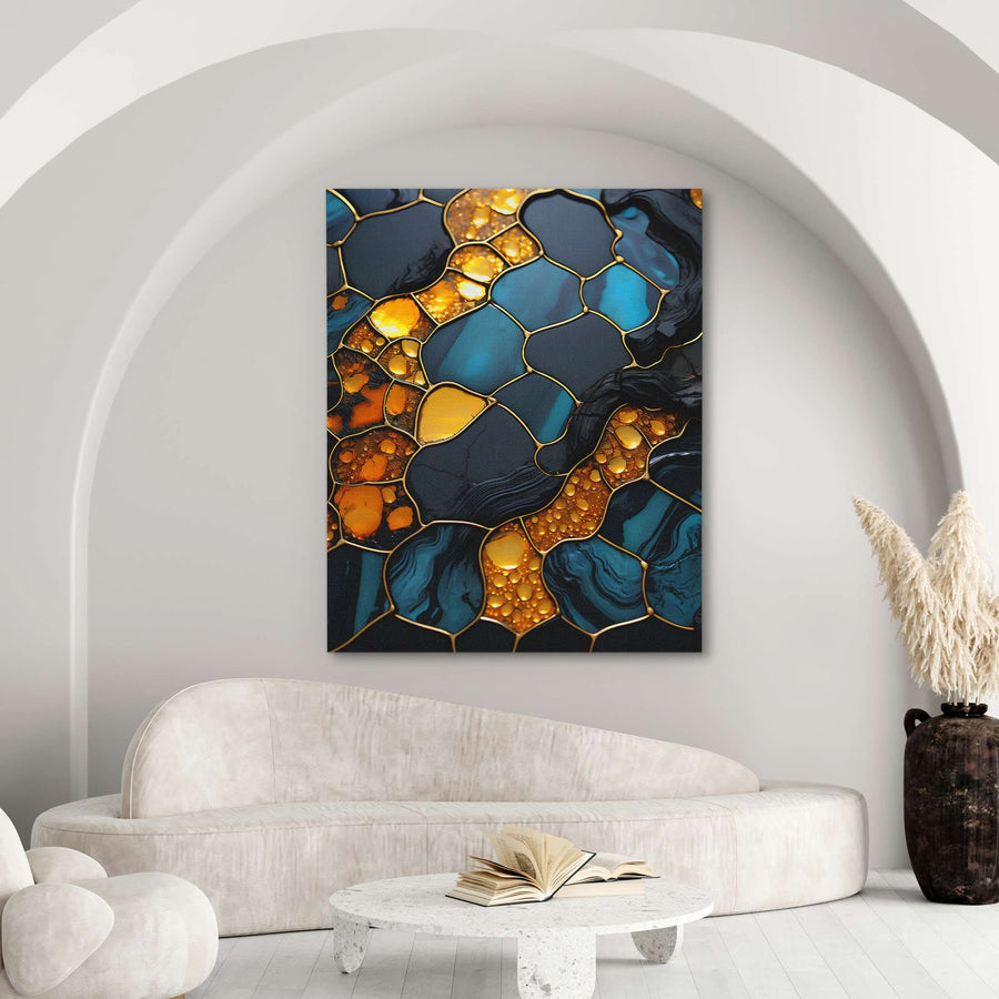
Different rooms, same rule. Let the gold sit against neutral walls and furniture so it stands out.
How big above the sofa?
TipA little gold goes a long way. One piece with gold detailing, picked up by a lamp or a frame, usually does more than several gold pieces competing at once.
Frequently Asked Questions
Wishlist