
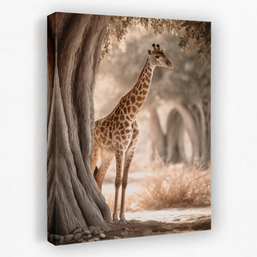
Neutral Bedroom Wall Art
Neutral bedroom wall art is the calmest, most timeless way to finish a bedroom. Cream, beige, and taupe read as soft and restful, and they never fight the bedding... read more
The trick with neutrals is texture and tone. Build on cream, beige, greige, and taupe, layer in linen, wood, and a few plants, and vary the shade so the room has depth rather than feeling flat.
Scroll down for the full styling guide, including how to size art over the headboard and how to keep a neutral room from feeling boring.


Designing a neutral bedroom
Neutrals are the calmest, most timeless scheme you can give a bedroom. They never fight the bedding and they do not date, which is why cream, beige, and taupe stay so popular. The work is layering texture and tone so the room feels soft, not flat.
Cream#efe7d6Light and airy
Beige#d6c5aaSoft neutral base
Greige#a99e8cGrey-beige blend
Taupe#8b7d6bDeeper grounding
Build a soft, layered base
Neutrals are the calmest scheme you can give a bedroom, and the easiest to live with long term. Build on cream, beige, greige, and taupe, then layer in texture so the room feels soft rather than flat. Art in these tones reads as restful and never fights the bedding. See the full neutral wall art range, or beige for the lightest tones.
Hang it over the headboard
Above the bed is the natural home for neutral bedroom wall art. Centre one larger piece, or hang a pair to match the width of the bed, with the bottom edge about 8 to 10 inches above the headboard. Because neutrals are quiet, a textured or line-art piece adds interest without adding noise. Browse everything made for the bedroom.
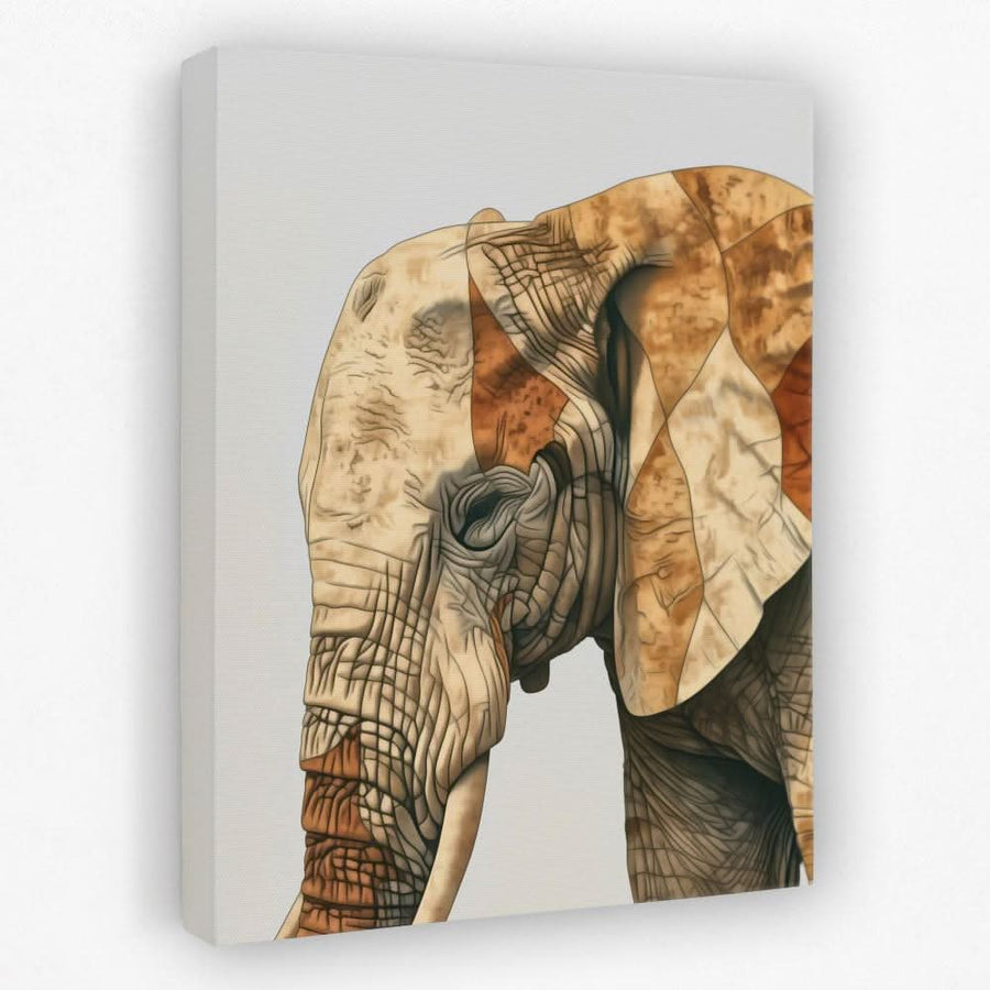
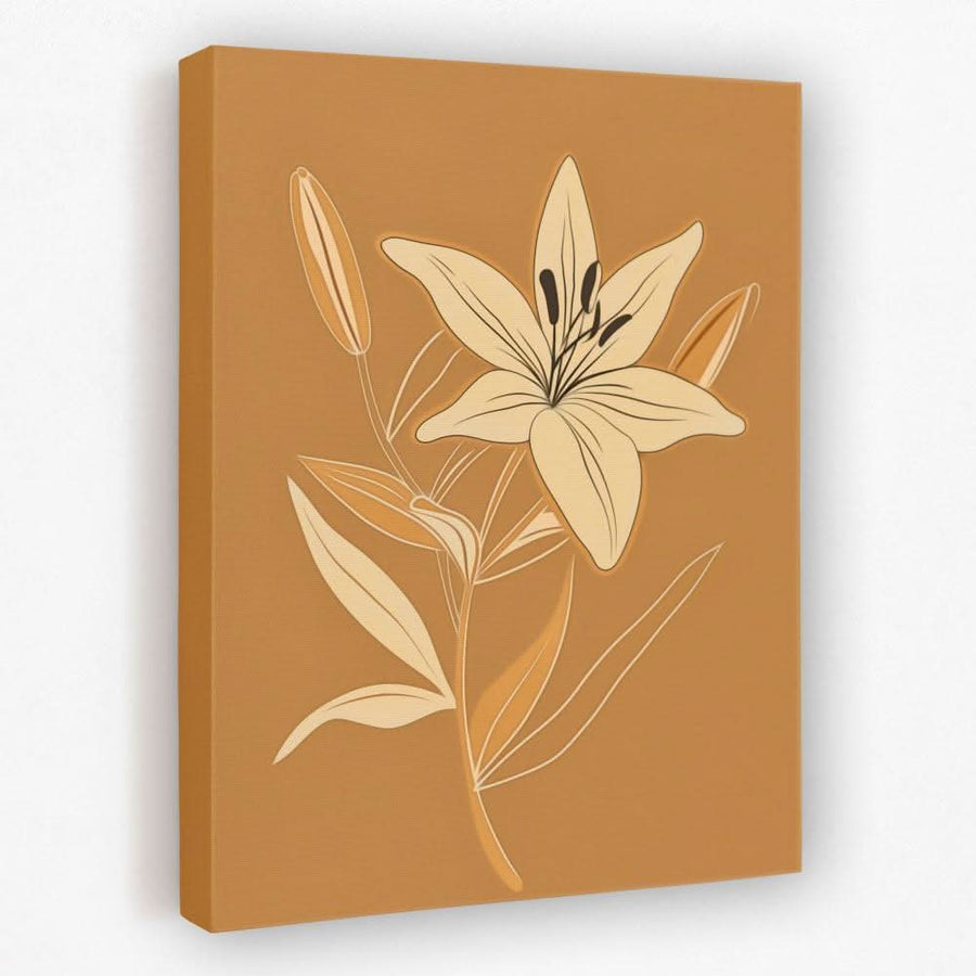
Soft, calm pieces suit a neutral bedroom best. A boho animal or a quiet botanical sets the tone over the bed.
Lean on texture and tone
With a neutral scheme, texture does the work that colour would elsewhere. Linen, wood, rattan, and a couple of plants keep a beige room from feeling flat. Vary the tone too, from cream through to taupe, so the wall has depth. Neutrals also layer beautifully with earth tones for a slightly richer scheme.
Pick a quiet subject
Soft botanicals, line-art figures, boho animals, and minimal abstracts all suit a neutral bedroom. The calmer the subject, the better it reads over a bed. Pick one direction and keep the palette tight. The wider nature art and botanical ranges fit well here.
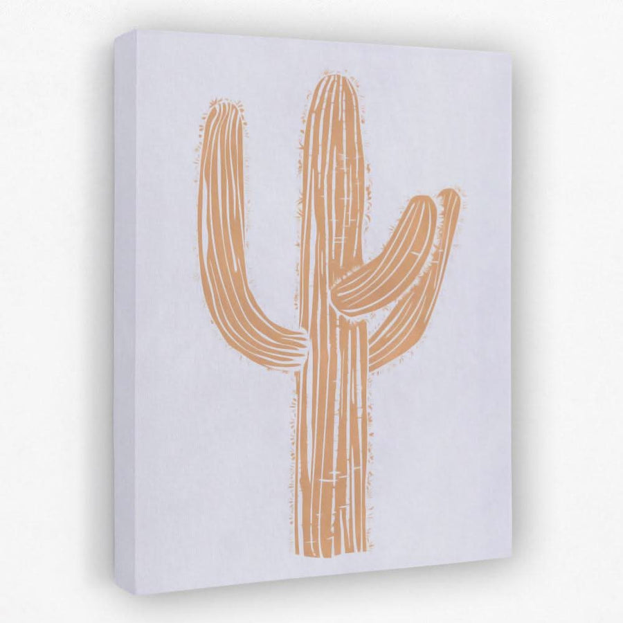
Vary the tone and subject but keep the palette tight, or stick to one calm piece above the headboard.
Where to hang it in a bedroom
TipIn a neutral room, texture does the work colour would elsewhere. A line-art or textured piece adds interest without breaking the calm.
Frequently Asked Questions
Wishlist