
Orange in Art: The Psychology of Warmth and Energy
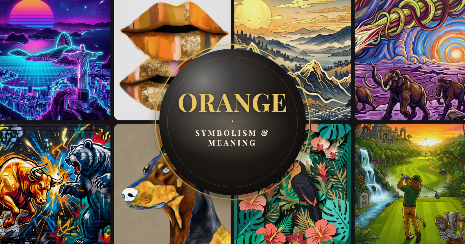

Orange in Art: The Color Nobody Picks First (But Should)
Ask someone their favorite color and they'll almost never say orange. It consistently ranks last in surveys across dozens of countries. Blue wins. Green and red fight for second. Orange sits at the bottom, somewhere near brown, quietly being the most useful color in the room.
That's the paradox of orange in art. It's the warmest color on the spectrum. It grabs attention faster than almost any other hue. It makes rooms feel alive and food look delicious. Painters from Titian to Rothko built entire careers around it. And yet most people won't paint their walls orange or hang orange art unless someone talks them into it.
Consider this your push.
A Brief History of Orange Pigment
Here's something most people don't know: the English language didn't even have the word "orange" until the 16th century. Before that, the color was just called "geoluhread" in Old English, which translates to "yellow-red." The word came from the fruit, imported from Asia via Arabic traders. The fruit gave us the word. Not the other way around.
As a pigment, orange has ancient roots. Realgar, an arsenic-based mineral, was used in ancient Egypt and China to produce vivid orange-red tones. It was toxic, which didn't stop artists from grinding it into powder and breathing it in for centuries. Orpiment, another arsenic compound, gave slightly more yellow-orange tones and was equally dangerous.
The real game-changer came in 1797 when French chemist Louis Vauquelin discovered chrome orange. For the first time, artists had a stable, vibrant, non-lethal orange pigment. The Impressionists loved it. Turner used it obsessively in his sunsets. And suddenly orange moved from the background to center stage.
Color fact: Orange is the only color in the English language named after an object (the fruit), rather than the object being named after the color. In many languages, the distinction between red and orange still doesn't fully exist.
Orange in the Masters: From Titian to Rothko
Titian made orange a luxury color. His use of warm, glowing orange-reds in fabrics and skin tones set a standard that Venetian painters followed for generations. The color suggested wealth, health, and sensuality. When Titian painted an orange robe, you could almost feel the fabric.
Claude Monet used orange to solve a technical problem. When painting haystacks at sunset, he needed a color that could convey both light and heat simultaneously. Orange did that. His series Haystacks uses orange so effectively that you can almost feel the temperature of the scene change across the paintings.

Mark Rothko stripped orange down to pure emotion. His color field paintings use orange as a presence rather than a depiction. Standing in front of a Rothko orange painting is an experience that photographs can't replicate. That painting Orange, Red, Yellow sold for $86.9 million in 2012.
Van Gogh was just as drawn to it. His sunflower series used orange and yellow to capture the intensity of Provencal light. He called it "a symphony in blue and yellow." The orange did most of the heavy lifting.

The Psychology of Orange
Color psychology research consistently puts orange in a specific category: energizing, warm, optimistic, and social. It stimulates appetite (which is why so many restaurants use it). It pairs well with art from our sunset paintings and abstract collections). It increases feelings of enthusiasm and creativity. And it communicates accessibility. Blue says "trust me." Red says "pay attention." Orange says "come hang out."
The warmth angle is real and measurable. Studies have shown that people estimate room temperatures as higher when the room contains warm colors like orange, even when the actual temperature is identical to a blue or white room. Your brain associates the color with heat so strongly that it adjusts your perception of temperature.
This makes orange wall art particularly effective in rooms that feel cold or sterile. A white room with a large orange piece immediately feels warmer and more inviting. It's one of the fastest ways to change the mood of a space without touching the furniture or paint.
Orange Across Cultures
In Hinduism and Buddhism, saffron orange is sacred. It represents fire, purity, and the quest for light. Buddhist monks wear saffron robes specifically because the color symbolizes the flame of faith and the sacrifice of material attachments. In India, orange is the color of courage and sacrifice, appearing on the national flag.
In the Netherlands, orange is the national color, tied to the House of Orange-Nassau. On King's Day, entire cities turn orange with clothing, decorations, and face paint. It's one of the few places where orange is associated with national identity and civic pride.
In Chinese and Japanese culture, orange represents happiness, good health, and prosperity. Oranges themselves are given as gifts during Lunar New Year. The color carries associations with harvest, abundance, and the warmth of autumn.
Using Orange Art in Interior Design
The trick with orange wall art is understanding that a little goes a long way. Orange is what designers call a "high-impact" color. A single orange piece in a neutral room does more work than three pieces in quieter tones. It anchors the eye, warms the space, and creates an instant focal point.
Orange plays well with more colors than people realize. It pairs naturally with navy blue (complementary contrast), forest green (autumnal warmth), charcoal gray (modern sophistication), and cream or beige (soft warmth). It clashes with very little when the shades are chosen carefully.
Our orange wall art collection includes pieces that range from bold, saturated abstracts to softer sunset tones and warm-toned landscapes. For kitchens and dining rooms, lean toward the bolder end. For bedrooms and reading nooks, softer burnt orange and amber tones create warmth without overstimulation.
Styling tip:Pair orange art with matte black frames for modern edge, or with natural wood frames for a warmer, organic feel. Avoid metallic silver frames, which can make orange look dated.
Styling tip:Pair orange art with matte black frames for modern edge, or with natural wood frames for a warmer, organic feel. Orange pairs naturally with navy blue, forest green, and charcoal.
In a neutral room, one bold orange canvas does the work of three quieter pieces. The color advances visually, meaning it feels closer than it is. That's what gives it that instant focal-point effect.

FAQ
What does orange represent in art?
Orange in art represents warmth, energy, enthusiasm, and creativity. Historically, it has been associated with luxury (Titian), light and heat (the Impressionists), and pure emotional experience (Rothko). Across cultures, orange symbolizes courage, harvest, spirituality, and celebration.
What colors go with orange wall art?
Orange wall art pairs well with navy blue (complementary contrast), forest green (autumnal warmth), charcoal gray (modern sophistication), cream, beige, and white (soft warmth). Black accents add modern edge. Avoid pairing with metallic silver or pastel pink.
Why is orange used in restaurants?
Orange stimulates appetite and creates a feeling of warmth and sociability. Research in color psychology shows that warm colors like orange and red increase hunger and encourage conversation, making them ideal for dining environments.
What rooms are best for orange decor?
Kitchens, dining rooms, and living rooms benefit most from orange decor. The color stimulates appetite and conversation in dining areas, adds warmth to living spaces, and energizes home offices. For bedrooms, use softer shades like burnt orange or amber to avoid overstimulation.
Why is orange sacred in Buddhism?
Buddhist monks wear saffron orange robes because the color represents the flame of faith, purity, and the renunciation of material attachments. Saffron dye was historically the cheapest available, fitting the monastic commitment to simplicity. The color also symbolizes the quest for spiritual light.
Written by Luxury Wall Art · Art experts passionate about helping you find pieces that speak to your space.